About Me

“Being a Good artist is the toughest job you could pick, and you have to be a little nuts to take it on” -Charles Saatchi, founder of global advertising agency Saatchi & Saatchi. I aspire to be as great and successful as him and hope that I can become somebody to be inspiring the way I am inspired by many great artists and designers. I am currently studying a BTEC National Diploma in Art and Design (Graphic Design) complemented with an A Level in Photography and I thoroughly enjoy this. It motivates me to continue on studying Graphic Design to gain new skills and expand my knowledge in the hope that this would help me fulfil my dream of becoming an Advertising Art Director. Art has always been a passion of mine from being a young child and I was taught the aesthetics of art from my Grandma. I have two younger siblings, ages 8 and 6 who keep me on my toes, so I find my Graphics work relaxes me. I enjoy taking photographs, spending time with friends, listening to music and reading books, autobiographies and articles. I also enjoy visiting galleries in the hope I can take away some inspiration with me. I am an outgoing person who is keen to have new experiences, travel and design.

Thursday 20 January 2011

Current Work (Lloyds TSB Art Of Nurture)

This is a drawing I have sketched using fine-liner, for the LLoyds TSB Art Of Nurture Brief. This brief concludes of a set of quotes in which we are to create an image that would represent the quote. This idea would be to reflect the quote "We stretch ourselves". I chose to focus on the body and in particular looked at the moves gymnasts do and how they stretch their muscles to create different shapes. I plan on experimenting further with this image.
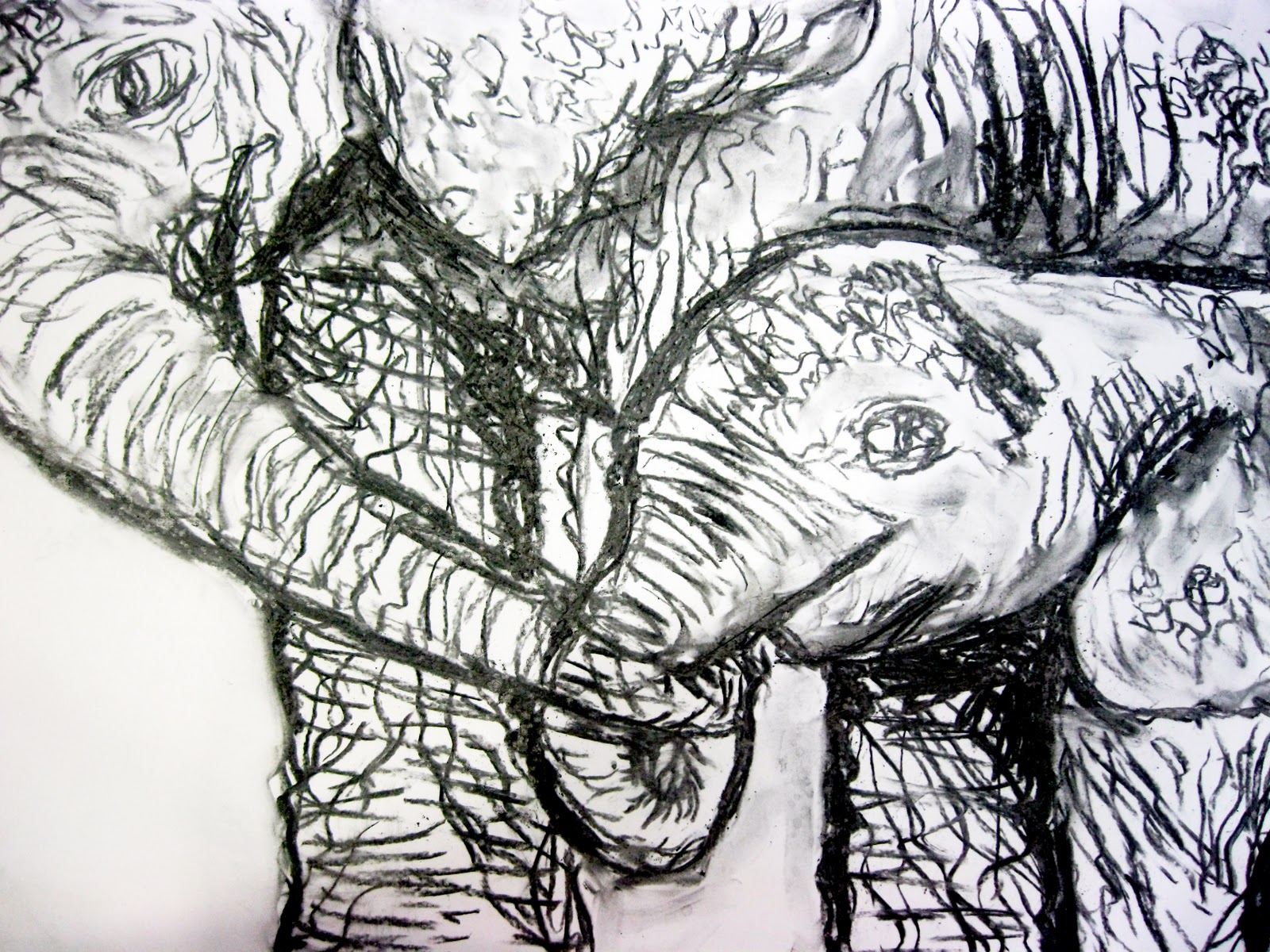
Here I used charcoal to sketch out a mother elephant and her infant. I felt this image would show "We succeed together" but more so "We take ownership" because the mother is holding her infant and playing her role as a mother. I feel in order for this to communicate the message more successfully I need to experiment more with the image and perhaps use more colour.
This was done using inks and water. I used a silhouette of a group of people in a rowing boat. This sport is quite strenuous and you have to work in a team for the boat to glide along the water. I felt this image gave a good representation to the Lloyds TSB quote "We succeed together". I would like to develop this further by digitally enhancing the image.

See It My Way (Typographic Design)

These are my artist research sheets. I looked at typography designers as the assignment See It My Way was to create something typographic to communicate visual impairments. I looked at Oded Ezer because I found his 3-dimensional work was interesting and Andrei D. Robu because of the way he experimented with colour and shape.
This is some of my ideas development. Here, I have used a range of media's and I experimented with kerning, leading and text alignment to communicate different types of visual impairments through using only typography. I also experimented with the 3-dimensional style used by Oded Ezer because I felt his work was effective and I wanted my work to be more illegible to effectively show an eye impairment.


These are my final posters. I printed these out on A3 and to display them as campaign series. Each poster represents a different type of visual impairment; double vision, colour blind and glaucoma, making each one stand out but still allowing them to link as part of a series because I kept the placement of the campaign title and contact information in the same places on each poster. The See It My Way assignment has been one of my favourite and I enjoyed the way I could choose design over legibility and be more daring.

U 1/2 Mail (Information Graphics)

This is some of my research from the Assignment U 1/2 Mail. This project was an information graphics project and we had to create a message and represent this using only symbolic graphic imagery. I felt this research was an essential part of the brief as this helped me to understand the point of information graphics and this shows a range of examples of uses of information graphics in everday life.
This was one of the artists I looked at for the assignment. I chose to look at the work of Banksy, as he is an influential and controversial artist who continually uses his artistic talent to express his current feelings on issues such as war, politics and general life. Whilst looking into his work I also noticed he uses symbols such as the peace sign and the anarchy sign.

This work shows my development of creating my message using only imagery. I experimented with colour, line and shape to find something that would appeal to a young audience and that would stand out in places like bars but would also enhance the communication of my message. I chose the bottom design as I felt the colours reflected the lights in a club.

This is my final outcome for the assignment U 1/2 Mail. My message I am putting across uses light irony as a way of engaging a younger audience. My message says that if you choose to drink alcohol you will end up with an unhealthy liver, but by choosing coffee your liver will be much healthier. The irony is that coffee is also bad for your body but the effects of alcohol on the body are far less compared to the effects of alcohol. I printed my final outcomes onto beer mats, as this would be suitable for it to be placed and shown in bars or pubs.

Journey Photography


These are a few images taken from my A Level Photography work. The project was based upon Journey and my idea was to communicate fashion and beauty as well as travelling. Travelling is something I myself am passionate about along with Vintage Fashions. Each image is taken from a different shoot and these were used to compile my own Photography book, entitled Waiting. This was due to the way I captured my models as they appeared to be waiting to start their Journey.