 |
| This is some of my research from the Assignment U 1/2 Mail. This project was an information graphics project and we had to create a message and represent this using only symbolic graphic imagery. I felt this research was an essential part of the brief as this helped me to understand the point of information graphics and this shows a range of examples of uses of information graphics in everday life. |
 |
| This was one of the artists I looked at for the assignment. I chose to look at the work of Banksy, as he is an influential and controversial artist who continually uses his artistic talent to express his current feelings on issues such as war, politics and general life. Whilst looking into his work I also noticed he uses symbols such as the peace sign and the anarchy sign. |

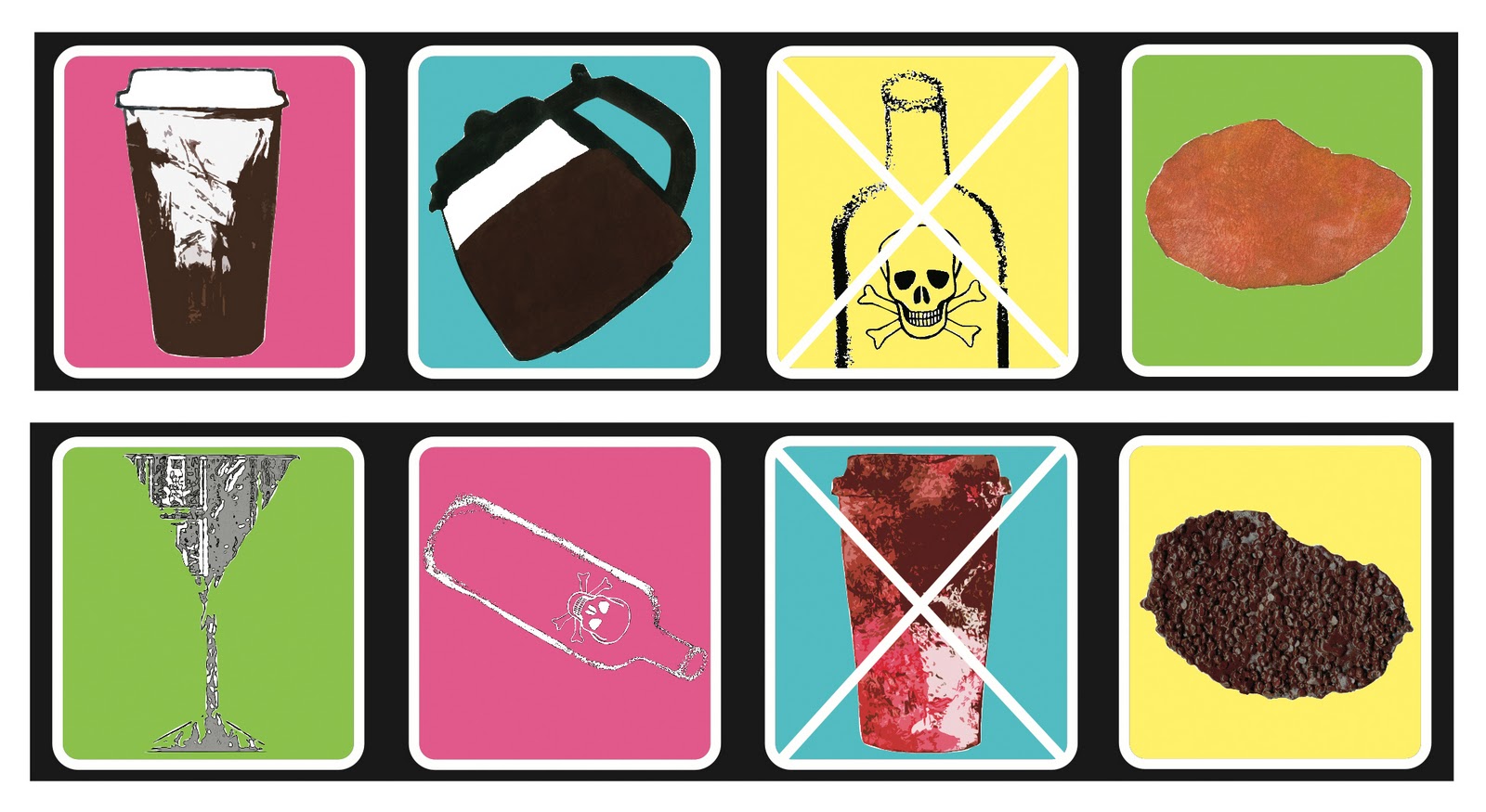 |
| This work shows my development of creating my message using only imagery. I experimented with colour, line and shape to find something that would appeal to a young audience and that would stand out in places like bars but would also enhance the communication of my message. I chose the bottom design as I felt the colours reflected the lights in a club. |

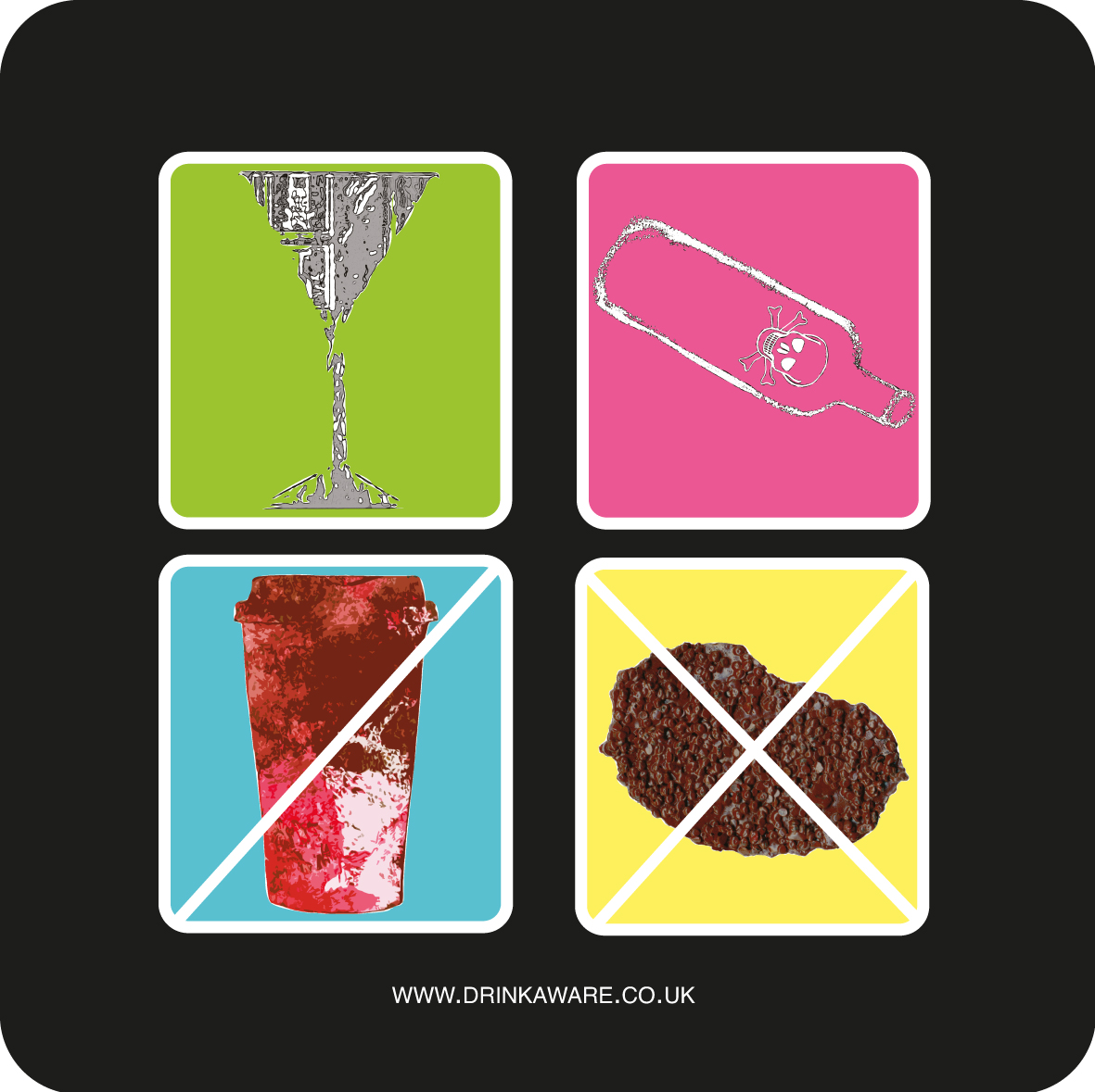 |
| This is my final outcome for the assignment U 1/2 Mail. My message I am putting across uses light irony as a way of engaging a younger audience. My message says that if you choose to drink alcohol you will end up with an unhealthy liver, but by choosing coffee your liver will be much healthier. The irony is that coffee is also bad for your body but the effects of alcohol on the body are far less compared to the effects of alcohol. I printed my final outcomes onto beer mats, as this would be suitable for it to be placed and shown in bars or pubs. |